
Web Standards and Accessibility for eiu.edu
Who is your audience?
Who is your audience? For many of you, that audience is prospective students. Remember that they are always the "me" on your website.
Don't try to write for prospective students ... and your dean and your faculty and your staff and your current students and your donors. You'll just end up diluting your important messages. And that makes the message less meaningful for everyone.
Always go back to your primary audience. Write for them and the messages they want to hear.
Prospective students don't care that some man they don't know named Bob just donated $10 million to your college. Let an internal email, your donor publications, and/or newsletter praise Bob for his amazing donation.
But on your website, let prospective students know that Bob's donation will provide 10 full scholarships that they can apply for to help them pay for college.
So, don't just give them meaningless facts, even if your dean or director says you have to announce those facts. They want to know why those things matter and... what's in it for them.
30/3/30 Writing For Your Website
In his 30-3-30-3 rule, Clay Schoenfeld suggests you present each webpage as if your audience will give you:
30 seconds. With a 30-second attention span, these folks are lookers. They’ll learn whatever they can through an image and a bold headline.
3 minutes. They’re not reading the text. Instead, they’re flipping, skimming, and scanning for key ideas. To reach them, you need to lift your ideas off the screen with a display copy.
30 minutes. These folks are readers, and don’t we wish there were more of them!
3 hours. These folks are researchers. They dive deep for data. Give them bottomless wells of information — libraries and archives of white papers, detailed product specs, PowerPoint decks, full texts of speeches and presentations, and so forth.
For the web, you need to write shorter, making each webpage as tight as possible. But you also need to deliver additional, longer pieces for your deep divers.
“Open with kernels for the 30-second reader,” write Daniel Cirucci and Mark Tarasiewicz. “Break to bits for the three-minute reader. Branch to detail for the 30-minute reader. Link to verbal and visual feasts for the three-hour junkie.”
30 Seconds: Should I consider EIU?
Think of the 30-second readers as those who just click on your site to find out the most basic information. They will only look at your homepage (or a program landing page) and just noticing the one or two things that stand out the most on that page before they leave.
3 Minutes: Do you have what I want and does it look interesting?
Your 3-minute readers are looking to see if you have a program they might be interested in pursuing, if you offer any scholarships, when is the application deadline, etc. Just the basics. They will look at your homepage (or program page) and the top-level pages in your navigation, scanning just the section headers and the images.
30 Minutes: I’m narrowing my choices and going to apply.
The 30-minute reader is someone who knows you have the program they want and they are looking into your admissions requirements, curriculum, faculty members, etc., as they decide if they want to apply and prepare to apply. They will look three or four clicks into your website and will scan the section headers and read the sections that are relevant to the information they are looking for.
3 Hours: I’m an administrator or faculty member.
A 3-hour reader is likely an employee who is looking for in-depth information and details about absolutely everything—the details about the who, what, when, where, why, and how. These readers are not fazed by how many clicks it takes to get to information because they are committed to finding out as much as possible.
Intro to Web Accessibility
Web accessibility means that websites, tools, and technologies are designed and developed so that people with disabilities can use them. People can: perceive, understand, navigate, and interact with the Web & contribute to the Web. This encompasses all disabilities that affect access to the Web, including auditory, cognitive, neurological, physical, speech, and visual.
Accessibility also benefits people without disabilities, for example mobile phones and other devices with small screens, different input methods, or even slow internet connectivity.
Why should my site be ADA compliant?
Several reasons. First, it makes your site more accessible to everyone. Instead of having a site that some people can access, you are creating a site that everyone can access.
Second, an ADA compliant site is more search engine friendly. Search engine robots are not human and essentially access and read your site the same way a screen reader for a visually impaired person works. Making your site more search engine friendly means more visitors to your site.
Third, it's the law! If the first two reasons did not convince you, this third one should.
Accessibility in the WYSIWYG
For most items you will not need to worry about anything. The Omni CMS templates including the main navigation, footer, and surrounding content are already accessible and always receiving updates. Any web elements provided by EIU Web Services will be optimized for accessibility as well. That means using components, snippets, and other tools are also accessible.
When using the WYSIWYG to insert headings, images, icons, and links you may need to
add some extra context.
Headings
Page structure is important for accessibility. Headings communicate the organization of the content on the page. Web browsers, plug-ins, and assistive technologies can use them to provide in-page navigation.
Images
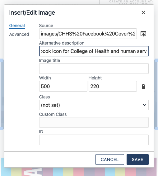
When adding an image, always remember to add a meaningful alternative description. This is helpful for multiple reasons. It aids a non-sighted user in understanding the image and what it is displaying, as well as provides text if an image cannot load.
Be as descriptive as possible. Rather than a brief description like "students walking, " describe the entire scene. e.g. "Two EIU students walking through a shaded part of the main campus on a sunny day."
Try to avoid using images with text in them. If you must use an image with text, be sure that all text in the image is typed out in the description.
Links
Use the Title attribute for your links when you can provide additional information about that link and/or the page it goes to. This text also displays in a tooltip when hovering over a link. A good title for a link with the text "Knowledge Base" would be "Step-by-Step Instructions". The title and link text should not match.
Do not use non-informative link text like Click Here, Learn More, Read More. In fact, the phrase "click here" is unnecessary, even if it precedes a more meaningful phrase. Shorten a link that says "click here to access today's weather" to "today's weather.”
Use concise, descriptive and unique link text.
Meaningful link text should not be overly general and should clearly describe the content to be found or action to be performed by the link (ask yourself if you could predict what you’d find if you clicked on the link by only reading the link text). Each piece of link text on a page should also be unique to the target of the link and be approximately two to five words long.
Using “Click Here” hurts accessibility and EIU is required to make all websites accessible
Visually impaired users will commonly move through content by tabbing through different links within a page. If the title of the link is “Click Here” it provides no context for where the link goes and what it does. Links should be labeled with the most important keyword or phrase people are looking for to guide them to the information they want.
Using “Click Here” hurts your ranking in search engines like Google.
Besides making the page more accessible to all users, but especially helps disabled
users, descriptive link text helps your search-engine ranking. “Click here” or the
URL does not tell Google any additional information about your link so it ignores
it, but meaningful text tells Google what you are linking to and that adds value to
your site and the linked site.
Also, when users are scanning your website, they want to see links that tell them where the information they are looking for is located. If they just see a link titled “click here,” they are forced to read the surrounding text to find out if that is what they are looking for. Don’t force users to read the text surrounding a link to determine where it leads.
DO NOT: Bury important links within the text
You should try to structure your sentences so that the links fall at the beginning or end of your paragraph or sentence, especially when you want your readers to complete a task – sign up, email comments, purchase tickets, etc. This will make links easier to spot because users will see each one as soon as they start or finish reading the sentence.
Web users also have very short attention spans and don’t read articles thoroughly or in their entirety. They skim webpages, especially when they want to complete a task, to find the information they need and burying a link makes it harder for someone to scan the page and find the information they are looking for.
Compliance Standard
Our goal is to meet the Web Content Accessibility Guidelines (WCAG) 2.0 Level AA standards. All templates are compliant and are always being updated for improvements in accessibility.
Accessibility Scan
We use Monsido to monitor our website for dead links, misspellings and other accessibility issues.
Colors
To promote consistency across all EIU websites, applications, and environments, the
EIU styles stick to a specific color palette.
We strongly recommend you stay within this palette to maintain consistency across
all EIU websites.
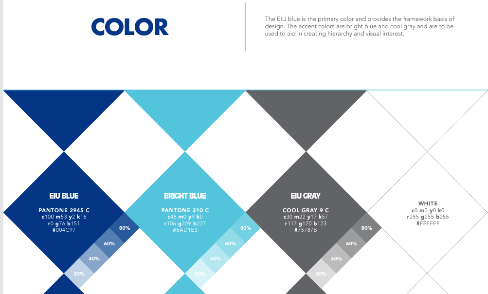
EIU Blue
c100 m53 y2 k16
r0 g76 b151
#004C97
EIU Bright Blue
c48 m0 y9 k0
r106 g209 b227
#6AD1E3
EIU Gray
c30 m22 y17 k57
r117 g120 b123
#75787B
White
255 g255 b255
#FFFFFF
Navigation
Using navigation keeps templates consistent across the website and aids users in finding content. The top navigation is the primary source to get around your site and there is only one per site. When setting up navigation for a site, it is helpful to structure them in a way that reflects the levels of files and folders in your site.
SEO Best Practices
SEO, or Search Engine Optimization is the process of making a website more visible in search results, or improving search rankings. Sites using the Omni CMS templates have had their code optimized for best SEO results. However, there are other techniques and tips that can help improve search rankings.
Content & Copywriting
Content is the most important aspect of SEO for Omni CMS users. Having well written content that uses keywords in it should be the primary focus. Identify what keywords your users would search for and work them into the text of the page. You may hear "content is king" frequently when researching SEO techniques.
Also, using the correct type of content matters. For example, making sure that a list
uses the bulleted list format or that headings are ordered correctly. These improve
the ability for search engines to crawl the page if the content is formatted properly.
Content Help
Visit Googles SEO Best Practices for details about modern SEO and more techniques as well as do's and don'ts when writing for the web. If you want to consult with someone about your site, contact Web Services. They offer website consultations as a service for the university.
Title & Description
A well put together page title and description are important when it comes to SEO. These can be completed using Page Properties.
Page properties are used to set information on your page like page title, but also information behind the page. The properties on this page are the general information for you page. These may be used for SEO, displayed in the browser tab, or show on the page.
Title and Metadata
This section allows you to set the HTML <title> tag and other meta information that is used by search engines.
Title
The HTML <title> of the page. This is displayed by the browser in the tab of your page. " | Eastern Illinois University" is appended to the end of every title.
Description
The meta description is an HTML attribute that provides a brief summary of a web page. Search engines such as Google often display the meta description in search results, which can influence click-through rates.
Google generally truncates snippets to ~155–160 characters. It's best to keep meta descriptions long enough that they're sufficiently descriptive, so we recommend descriptions between 50–160 characters.
A page's meta description should intelligently (in a natural, active, non-spammy way) employ the keywords that page is targeting, but also create a compelling description that a searcher will want to click. It should be directly relevant to the page it describes, and unique from the descriptions for other pages.
Text
When working with text there are some do's and don'ts that can help make sure that your page is easy to read. Using spacing between sections, replacing content with snippets, and using buttons instead of links are just a few of the ways you can improve user experience on your site. See the do's and don'ts below for some examples of what not to do and alternatives you can use instead.
*Tips to help your users:
- Include the most important points in the first two paragraphs on the page.
- Use headings and subheadings.
- Start headings and subheadings with the words carrying most information.
- Visually group small amounts of related content.
- Bold important words and phrases.
- Take advantage of the different link formatting (links, buttons, etc.), and ensure links include information-bearing words (instead of generic “go”, “click here” or “more”).
- Use bullets and numbers to call out items in a list or process.
- Cut unnecessary content.
Readability
Don't Create Walls of Text
When entering several paragraphs of information it can become hard to read.
Add Spacing
When finishing a section of text hit Enter to create an empty paragraph, or Shift + Enter to create a blank line. Doing this multiple times and combining with a horizontal line to break up sections can make them easier to read.
Don't Overuse Bold, Uppercase, or Italics
If everything is bold, nothing is bold. Use bold text sparingly to increase scannability of keywords. The same is true for all uppercase text, if there is no variation in the height of characters text becomes harder to read. Italics should be used to emphasize words. All of these styles have an effect on how a screen reader will read the text to a user, so use them appropriately.
Using Color on Your Website
Repetition assigns relative meaning to elements; if all “paragraph” text is grey, when a user sees a new block of grey text, he can assume it’s another basic paragraph; when that same user encounters a blue link or a black title, he can safely assume it is different and unique from the grey text.
Don’t underline anything but links
People expect underlined text online to be linked to something. If it isn’t, you’ll do nothing but confuse your visitors.
*If you have a large international audience for your website, be mindful of the cultural implications of the colors and images you select
Emphasize Keywords and Phrases
Use bold and italics sparingly to drive home the important elements of your text and increase the scannability. This makes it easier for users to find the information you want and to the actions you want them to take.
Important Links
Don't Hide Important Links
Placing links inside of long paragraphs of blocks of text can make them harder to identify when scanning a page.
Use Buttons
Buttons are a great way to call attention to an important link. Include a short message or information about the link above it. When entering text for your link describe the action or page you are linking to (ex. About Us, Register Today, Learn More). Avoid using phrases like 'Click Here' or lenthy text such as 'Resister for Classes in Spring Semester'. Instead say 'Register Now' or 'Get Started'.
Don't Create Large Text or Bold Messages
It can be tempting to use the WYSIWYG editor to create extremely large, uppercase, bold, or colored text. Avoid this method when entering important messages.
Images of Text
Don’t add a PDF of an event flyer to a page, put the text and images on the page.
Images
Graphics and images can make a huge difference in how your site appears and how users interpret its intentions. Images can help you attract attention and guide your users’ line of sight. They can be of great value when it comes to presenting important information.
Image processing happens in a different part of the brain from where words are processed, so putting them with your words will engage more of your viewer’s brain.
Images are especially effective to activate associations. If you spark an experience or memory with your image, you can convey meaning that goes well beyond the picture.
However, you should only use images that somehow support your content. For every image on your site, you should be able to answer four questions:
- Why did you chose that image and not a different one?
- Why did you place the image where you placed it, and not somewhere else?
- Who is your primary target audience and what type of imagery will speak to them?
- What underlying message are you trying to convey – Undergraduate Research wants to emphasize research outside of the science, so they could use photos of students in the field and not just in a lab.
The images people look at most have the following characteristics:
- Are high contrast and high quality (crisp and colorful)
- Are cropped, rather than overly reduced, when necessary to fit a small space
- Are not excessively detailed: easy to interpret, almost iconic
- Are highly related to the content on the page
- Possess magnetic features
Features that make images magnetic include the following:
- Smiling and approachable faces - They make us feel like we are actually connecting with other humans, not only with some coded website
- People looking at (or at least facing) the camera
- Clear instructions or information
People ignore images that have the following characteristics:
- Are low contrast and low quality
- Are too busy for the space
- Look like advertisements - People don’t like ads and over the years they have successfully learned to ignore them
- Are not related to content on the page or only slightly related to it - people look for the content and ignore unrelated visual noise
- Are boring
- Include people or objects that are generic or obvious stock art
- Are cold, fake, or too polished
*If you have a large international audience for your website, be mindful of the size of your photos and make sure they are optimized for the web for quicker loading on slower internet connections.